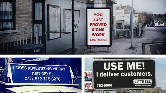
You’ve seen them. Blank billboards and poster boards with varieties of “Advertising Works” slogans. They’re the billboard version of a used car salesman, pushing a product —outdoor advertising—with a half truth, luring in ad sales with fingers crossed behind their backs.

Advertising doesn’t work
Advertising doesn’t work. In the case of billboards, just being seen isn’t success. Exposure is not enough. The goal of advertising is awareness (being seen), yes, but it’s also sales or action. Although most advertising experts will agree that billboards aren’t for direct sales—selling something directly from the medium to the consumer—billboards are supposed to cause movement or sales. If the billboard (or poster, ad, flyer, brochure) doesn’t lead a person to call, email, reach out, or stop by because of increased awareness (either directly or indirectly), the ad didn’t “work.”
Advertising doesn’t work. Good advertising works.
Good advertising requires good copywriting
Advertising almost always involves copywriting, and good advertising requires good copywriting. If you’ve chosen outdoor advertising as a part of your marketing and advertising strategy, there are key elements of a good billboard.
Other things to consider about your outdoor advertising:
1. Simplicity—Six words or less
Keep it short and sweet. The general rule is six words or less, although some say seven. People are passing quickly in vehicles don’t have the time to read your wordy copy or graspy a nuanced message. It needs to be short, simple, and clear.
2. Show a clear benefit
Copywriting is writing about the good night’s rest, not the bed. The best copywriting communicates why the thing is the best or what it delivers. How does it make a difference in a person’s life? A feature is a fact about the product or service and a benefit answers the question, “So what? What’s in it for me?”
3. Choose good images with impact
Use quality custom photography (no cheesy stock photos) or illustration. Don’t include anything unnecessary (remember: simple) or cute, unless cute is your message and creative strategy. The image or design with the copy needs to be memorable.
4. Be creative
Don’t be afraid of unconventional ideas or 3-D approaches, including those that use areas above, below, and around the billboard. Here’s a cost effective 3-D PSA in Colorado. Here’s a minimalist approach.
5. Don’t be distracting
Chances are that you’re not going to take a Wonderbra approach. But if you come up with some highly attractive or creative approach, consider the collateral damage of getting too much attention.
6. Be effective, not just clever
Puns, wordplay, and cleverness are not copywriters’ biggest tools. Copywriters’ best tools are product, customer, and client knowledge, along with their writing abilities. Cleverness isn’t forbade, but it has to accomplish the campaign goal. It has to sell, move, and lead to action. Something that makes you smile but is quickly forgotten accomplishes very little for a brand.
Here are some other things to consider about your outdoor advertising campaign:
- Strategy: Should you be using outdoor advertising in the first place? Do you have the budget for the impact? Or do you have a complex product or service? Skip billboards altogether. Your sales and relationship process is different, and billboards aren’t for you.
- Location: know where the billboard is going to be. Don’t write “take next turn” if that’s not the right direction or if there’s going to be construction. Use the location to your advantage. Advertise by a competitor or by another business that complements your business (bar ad by a stadium, breakfast place ad near a church).
- Number of billboards: billboards are not cheap, and to increase impact, it’s better to buy in quantity. If you’re not sure how to determine the impact (i.e., you don’t what a gross rating point is) of the number and placement of your billboards, enlist the help of a media planner.
Inspiration
- 40 Absolutely Brilliant Billboard Ideas
- 15 Fantastic Billboards
- Creative Billboard Advertising Designs
- Pinterest search of “billboards”
What are your favorite billboard campaigns? Ever seen a bad one? Share in the comments!
Featured blog photo by Kash Goudarzi via Unsplash


